In this article, We are going to see how to add text inside the plot in Matplotlib. The matplotlib.pyplot.text() function is used to add text inside the plot. The syntax adds text at an arbitrary location of the axes. It also supports mathematical expressions.
Syntax: matplotlib.pyplot.text(x, y, s, fontdict=None, **kwargs)
Parameters:
- where x, y – coordinates
- s – text to be added inside the plot(string)
- fontdict – optional parameter. It overrides the default text properties
- **kwargs – text properties
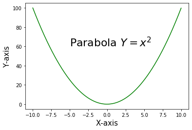
Example 1: Adding mathematical equations inside the plot.
Python3
import matplotlib.pyplot as pltimport numpy as np x = np.arange(-10, 10, 0.01)y = x**2 #adding text inside the plotplt.text(-5, 60, 'Parabola $Y = x^2$', fontsize = 22) plt.plot(x, y, c='g') plt.xlabel("X-axis", fontsize = 15)plt.ylabel("Y-axis",fontsize = 15) plt.show() |
Output:
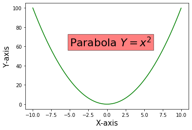
Example 2: Adding rectangular box around the text by using the keyword ‘bbox’. bbox is a dictionary of Rectangle properties.
Python3
import matplotlib.pyplot as pltimport numpy as np x = np.arange(-10, 10, 0.01)y = x**2 plt.xlabel("X-axis", fontsize = 15)plt.ylabel("Y-axis",fontsize = 15) #Adding text inside a rectangular box by using the keyword 'bbox'plt.text(-5, 60, 'Parabola $Y = x^2$', fontsize = 22, bbox = dict(facecolor = 'red', alpha = 0.5)) plt.plot(x, y, c = 'g') plt.show() |
Output:
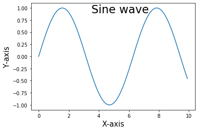
Example 3: Adding the text “Sine wave” inside the plot.
Python3
import matplotlib.pyplot as pltimport numpy as np x = np.arange(0, 10, 0.1)y = np.sin(x) plt.plot(x,y) plt.text(3.5, 0.9, 'Sine wave', fontsize = 23) plt.xlabel('X-axis', fontsize = 15)plt.ylabel('Y-axis', fontsize = 15) #plt.grid(True, which='both')plt.show() |
Output:
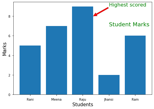
Example 4: Using annotation along with text inside plot
Python3
import matplotlib.pyplot as pltimport numpy as np x = ['Rani', 'Meena', 'Raju', 'Jhansi', 'Ram']y = [5, 7, 9, 2, 6] plt.bar(x,y) plt.text(3, 7, 'Student Marks', fontsize = 18, color = 'g') plt.xlabel('Students', fontsize = 15)plt.ylabel('Marks', fontsize = 15) plt.annotate('Highest scored', xy = (2.4, 8), fontsize = 16, xytext = (3, 9), arrowprops = dict(facecolor = 'red'), color = 'g') plt.show() |
Output: